Facebook Ad Design Case Study
Share on 


Jul 27, 2016 by Mark Maier I have been through several Digital Marketer courses and I really found their Social Community Management course interesting and compelling. The latest article that I got a lot out of from them has to do with Facebook ad design and how you can improve your skills for your clients. Yes, I have designed my own Facebook ads but what am I doing right and what am I doing wrong according to those that have expertise and data to back it up?...
"Today I’m analyzing 10 Facebook ads from a variety of markets to help inspire you to make your ads look and connect better with your brand and audience.
Let’s get started!
1. Back to School

What They Did Right
The concept here is simply amazing and I loved how they tied the hook into their imagery. The little paper airplanes are pointing towards the ad copy, directing your eye where to go – a brilliant design choice.
The color choices are subtle, but pop just enough to catch your attention.
They were also able to tie back in the message, “Stand out! Be a Trailblazer” by making one of the paper planes a bright red color separate from the others.
And, finally, adding the logo in the top left corner was the key to tying the brand together.
What They Did Wrong
There was a missed opportunity here to be trailblazer with their text. “Stand out! Be a Trailblazer” could’ve been larger and bolder, while still fitting the Facebook guidelines 20% rule.
As it stands, the top line is a bit hard to read. As the main hook, it could stand to be more prominent.
How They Could Make It Better
Adjust the text size a little bit, and they’ll be good to go. Overall, this ad is top-notch.
2. Save Time with HubSpot

What They Did Right
I love the concept here. HubSpot did a great job with this one. They do a really nice job tying in the imagery with the offer.
What They Did Wrong
The overall resolution of the image is definitely low which makes it hard to consume.
Although the concept is great, it is executed a little rough. I think it just needed a bit of Photoshop retouching to make some things stand out or just use a better camera when taking the original photo.
How They Could Make It Better
Zoom up on the phone a little more since that is that main focus.
Also, brighten up the image overall. It’s much harder for your eyes to focus on something when the picture is dark and grainy — there is no clear focal point.
3. Need a Loan?

What They Did Right
The concept, colors, layout — I love everything about this image!
It definitely catches your attention right off the bat. They executed the flat-illustrated look very nicely.
I love the hook “Small business loans are changing” and the correlation with the imagery of the world’s ever-changing technology.
The color palette is a great choice; very bright and vibrant.
Check out how they showed emphasis on the typewriter by making it orange and contrasting against the rest of the image.
What They Did Wrong
Nothing. It’s great as is! The concept is amazing!
How They Could Make It Better
They could’ve made the text in the image stand out just a little bit.
And, for branding purposes, they could add their logo in the corner. Overall, a very well-done ad :).
4. Got Backlinks?
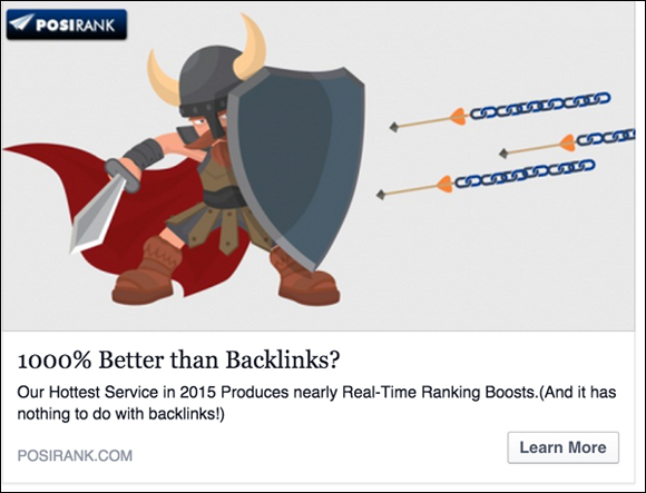
What They Did Right
The imagery looks fun and playful, but the concept here is lacking just a bit. I am a little confused and not really sure what to do or where to go with this one. The illustration is nice, but it’s a little too misleading and unclear.
What They Did Wrong
This is not a good example of leaving text off the ad image. By adding a call-to-action in the image to grab someone’s attention, it could make someone a little more interested to find out more about the offer.
How They Could Make It Better
Re-think the hook and correlate it with some better imagery that ties into their offer a little more.
Also, add some text in the ad image and be clearer on the overall message.
5. Craft Your Design

What They Did Right
This ad really did a great job catching my attention and to the “specific target audience” — especially considering I know this design platform a little too well ;).
I love how they took the hook “Craft your design without code” and implemented it in an actual design program. Then, made it look like it was in the process of being designed – very, nicely executed.
Also, the subtle splash of bright yellow and blue buttons against the dark background was a nice choice to make it POP!
What They Did Wrong
Nothing. They really did a great job!
How They Could Make It Better
They could’ve made the CTA button a little bit bigger – as long as it would work with the 20% rule.
(NOTE: Want the Ultimate Facebook Ad Template Library? Copy & paste these 7 proven Facebook ad campaigns to create low-cost, high-converting ads on demand. Get them here.)

6. Change the World

What They Did Right
I do like how the logo is implemented in the ad, but it is a bit confusing on what the offer is or what they are trying to convey.
What They Did Wrong
Not giving enough thought into the concept and imagery choices. Leaving out any type of CTA to the image. There’s no reason for someone to click on the ad.
How They Could Make It Better
Think more creatively to tie the message into the imagery while still implementing the brand – look for examples and research to get inspiration (We all do it!). It helps to create many rough sketches/mockups before creating the actual final ad image on the computer.
Also, adding a clear, short call-to-action in the image is always helpful and makes people interested to find out more about the offer.
7. Built for Small Businesses
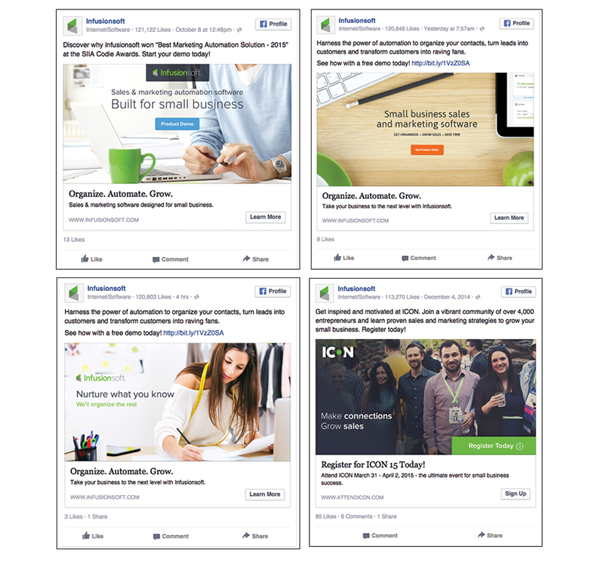
What They Did Right
I wanted to show a few ads from InfusionSoft to show how they stay true to brand consistency.
By having a similar color palette and 1-2 similar typography choices throughout their aesthetic, it really allows these ads to be easily recognizable. They always have a very, clear message.
Also, it is great how they can take regular stock imagery and Photoshop them very slightly to their brand by bringing in branded colors and fonts. Overall, they stay true to that “business” look and feel since they are a platform for small businesses.
What They Did Wrong
Nothing, this is a great example of using design and imagery to reach your audience and stay true to your brand!
How They Could Make It Better
Not a note to share — this a great example of staying true to your brand across the board!
8. Selling Smart
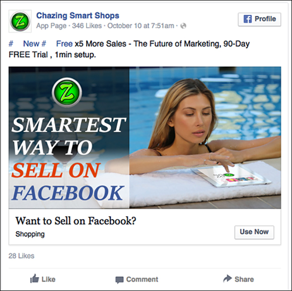
What They Did Right
The color choice is nice, and I do like how they incorporated the logo. Branding is always very important.
But the imagery seems to be a little off and it is not really clear to me on what they are selling and may even seem like a scam to others.
What They Did Wrong
Just correlate the copy with the image a little better.
The copy, “Smartest Way to Sell On Facebook” and a girl looking at an iPad in a pool does not really tell me very much at all. It leaves things open ended and unclear and is not really engaging to the consumer to learn more about the offer.
How They Could Make It Better
To be able to convey a simple, clear message that can tie in with the imagery a little better while still maintaining the brand’s identity.
9. Get Hired

What They Did Right
The concept here is absolutely spot-on!
I love how they tied in the hook with the imagery and I really enjoy the simple, custom illustrated look. The 2 different people in different job settings is very nicely executed – especially by the change of color and how they put more emphasis on the right side by making it bright blue, vibrant, and happy looking – and the left side is very sad, dark and gloomy.
Also, the use of white space around the circles is really eye-catching and breaks out of the normal “rectangle” dimension that we are all used to seeing! This is also a good example of the imagery being so strong that it conveys the message without needing any text on the ad image.
What They Did Wrong
Nothing, this is a great use of imagery and message-match.
How They Could Make It Better
Nothing — the imagery explains it all! No need to clutter it with more info.
10. Be a Social Monkey
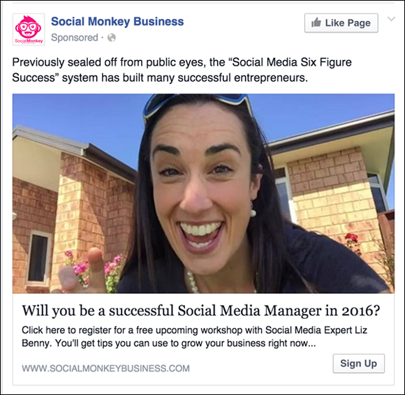
What They Did Right
They mention “successful entrepreneurs” so adding a person smiling looking directly at you can definitely grab your attention, but it’s just not enough to make someone interested enough to click.
Give them a CTA on the image, especially while trying to gain credibility.
What They Did Wrong
Not adding any text or CTA on the image.
How They Could Make It Better
Definitely adding text or a CTA and playing more with the image; maybe adding a speech bubble with a message inside.
Something to make it pop and look more like an ad and not just a random picture on Facebook.
You want something to stand out NOT blend in.
(RELATED: Template Download How to Build Highly Engaging Images for Your Facebook Page)
And that’s it! Use these ads for inspiration when you’re creating your next campaign and reap the rewards with your audience.
(NOTE: Want the Ultimate Facebook Ad Template Library? Copy & paste these 7 proven Facebook ad campaigns to create low-cost, high-converting ads on demand. Get them here.)"
Related Categories
